ShoeBDTN co-owner, Kalen came to me with a clear desire: they wanted a visual identity that felt clean, bold, and unmistakably Tennessee‑rooted. Their products deserved packaging and branding that communicated confidence and quality at first glance, and the brand needed a look that could grow with them.
Project Overview
The Challenge:
We started by locking in the brand’s core visual direction: clean and bold with an authentic nod to Tennessee pride (“TN stamped”). This concept became the backbone of the visual system influencing logo work, color choices, typography, packaging, and overall brand language.
Brand Development
From the start, I took a complete branding approach not just a logo design, but a full suite of visual assets:
• Logo and brand marks
• Color palette and type system
• Brand elements and patterns
• Digital assets (web graphics, social templates)
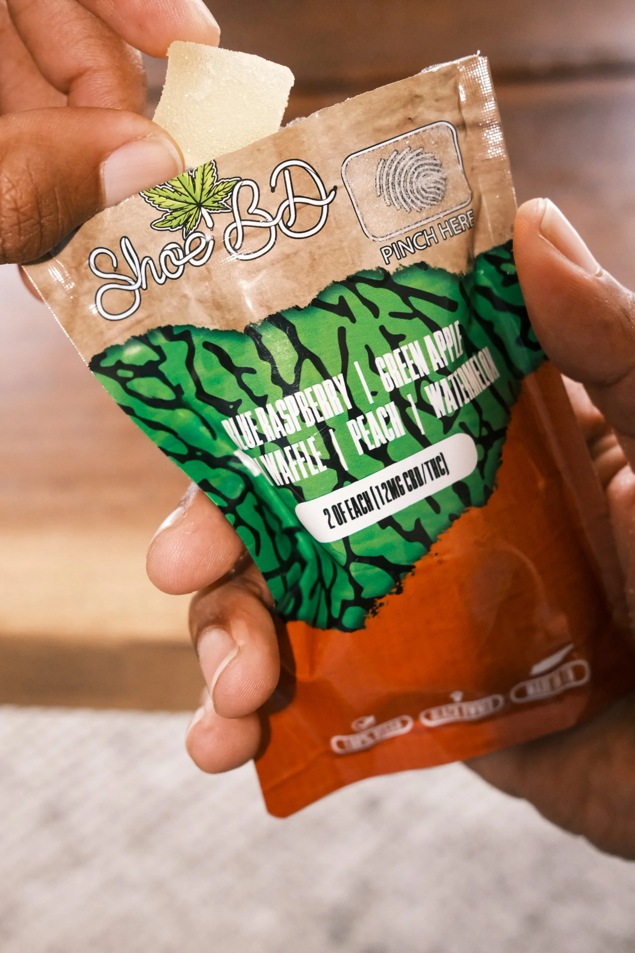
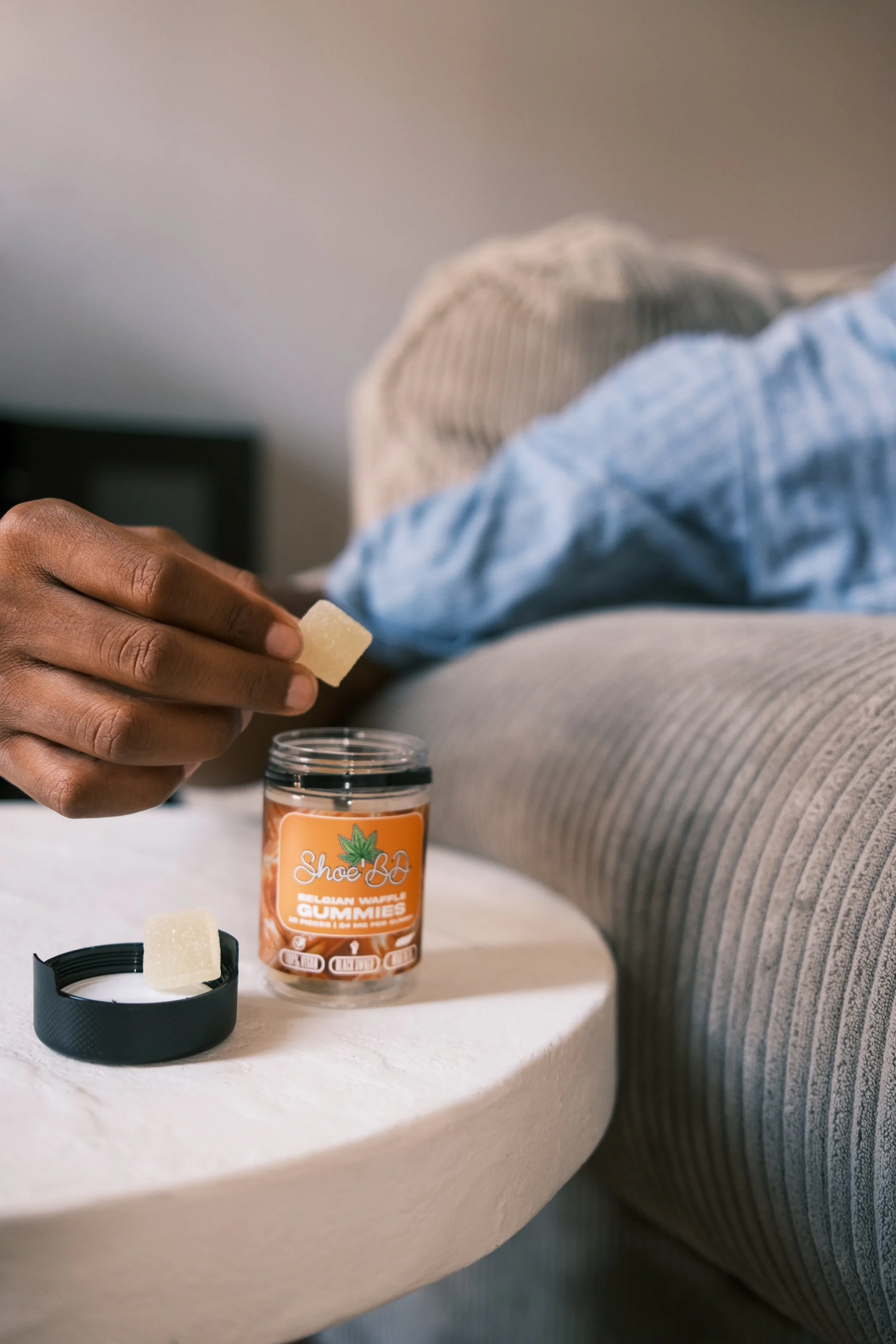
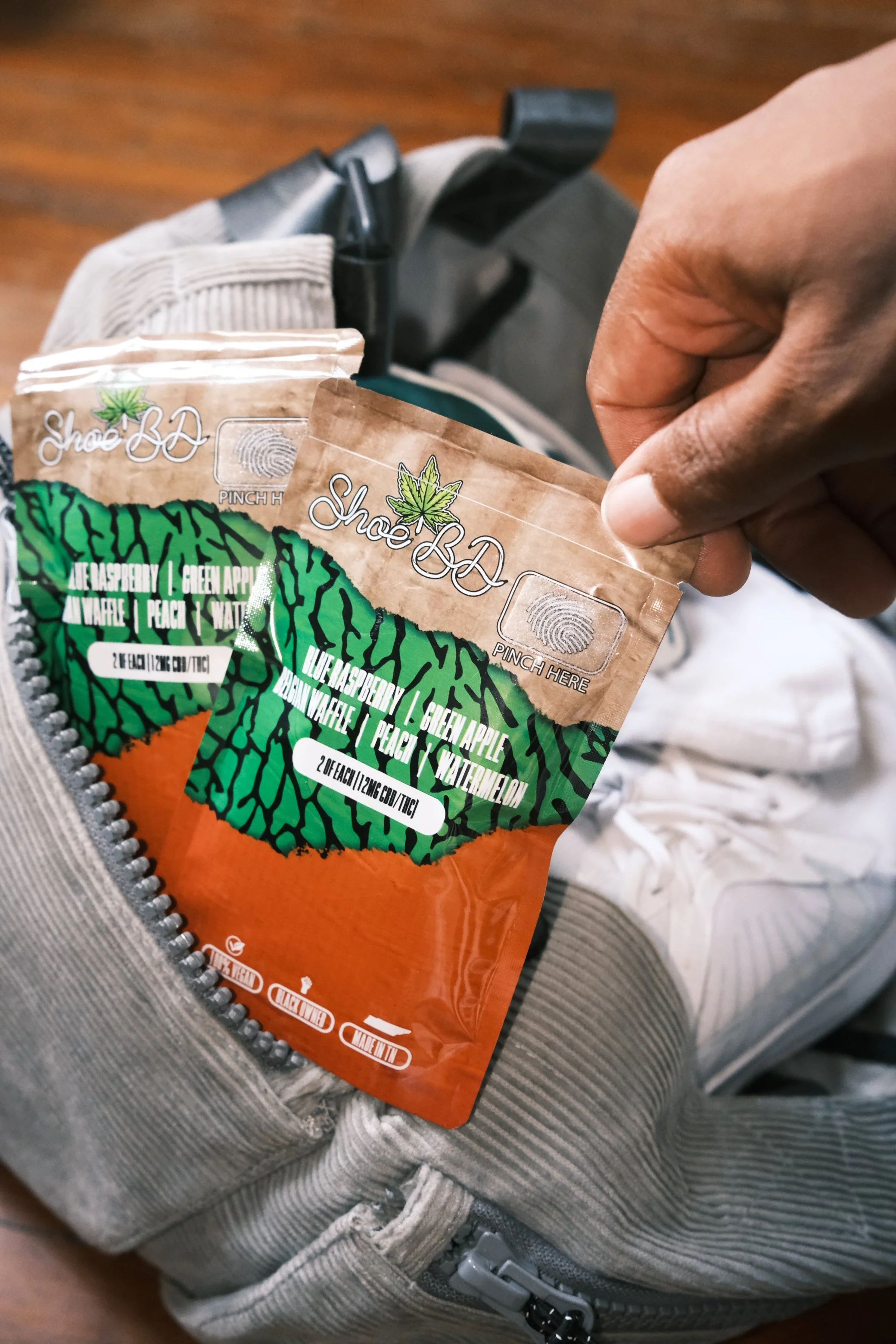
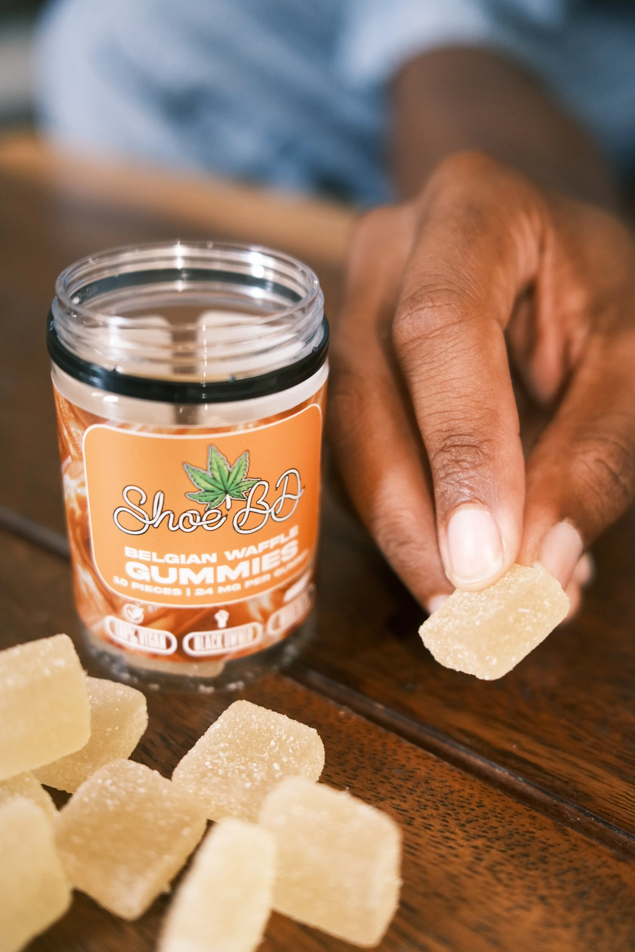
• Packaging design (custom product bags + jar labels)
Every choice was intentional and crafted to enhance brand recognition while keeping the aesthetic straightforward and bold. The visual identity felt purposeful without overcomplicating the message clean enough to stand out, strong enough to carry presence.
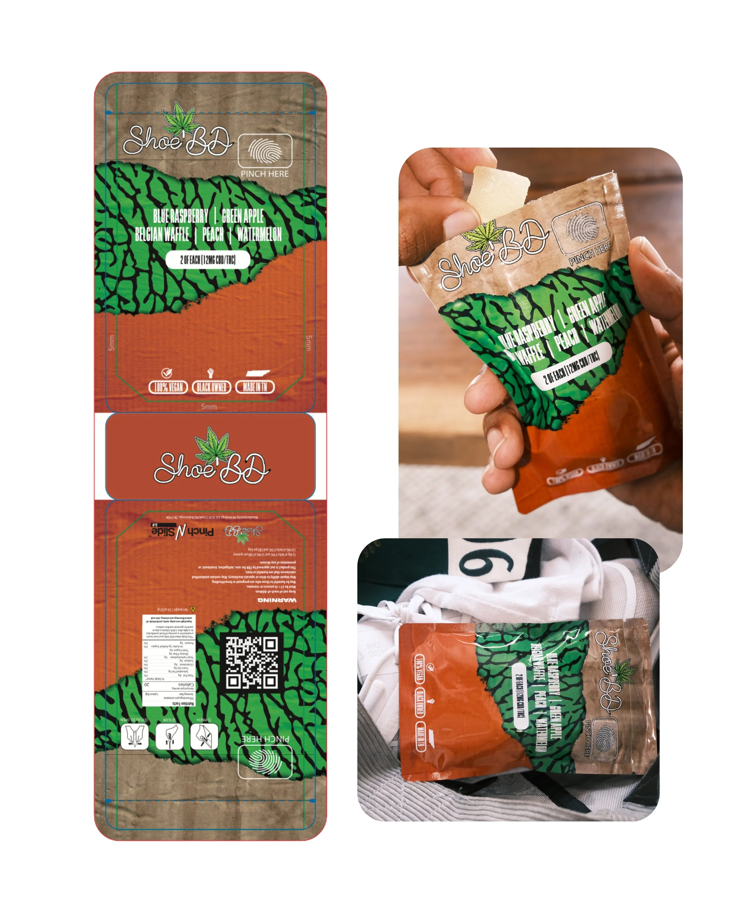
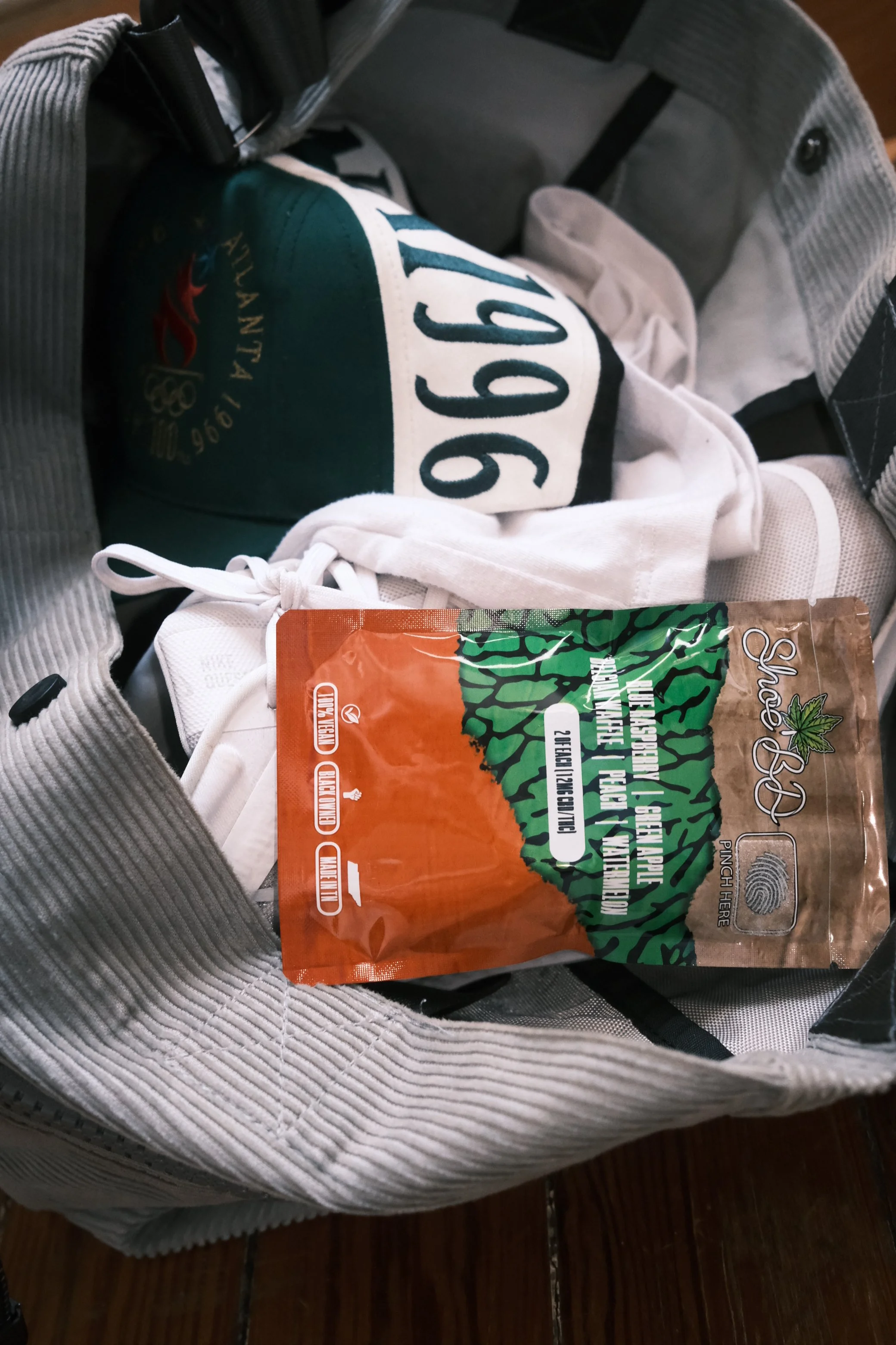
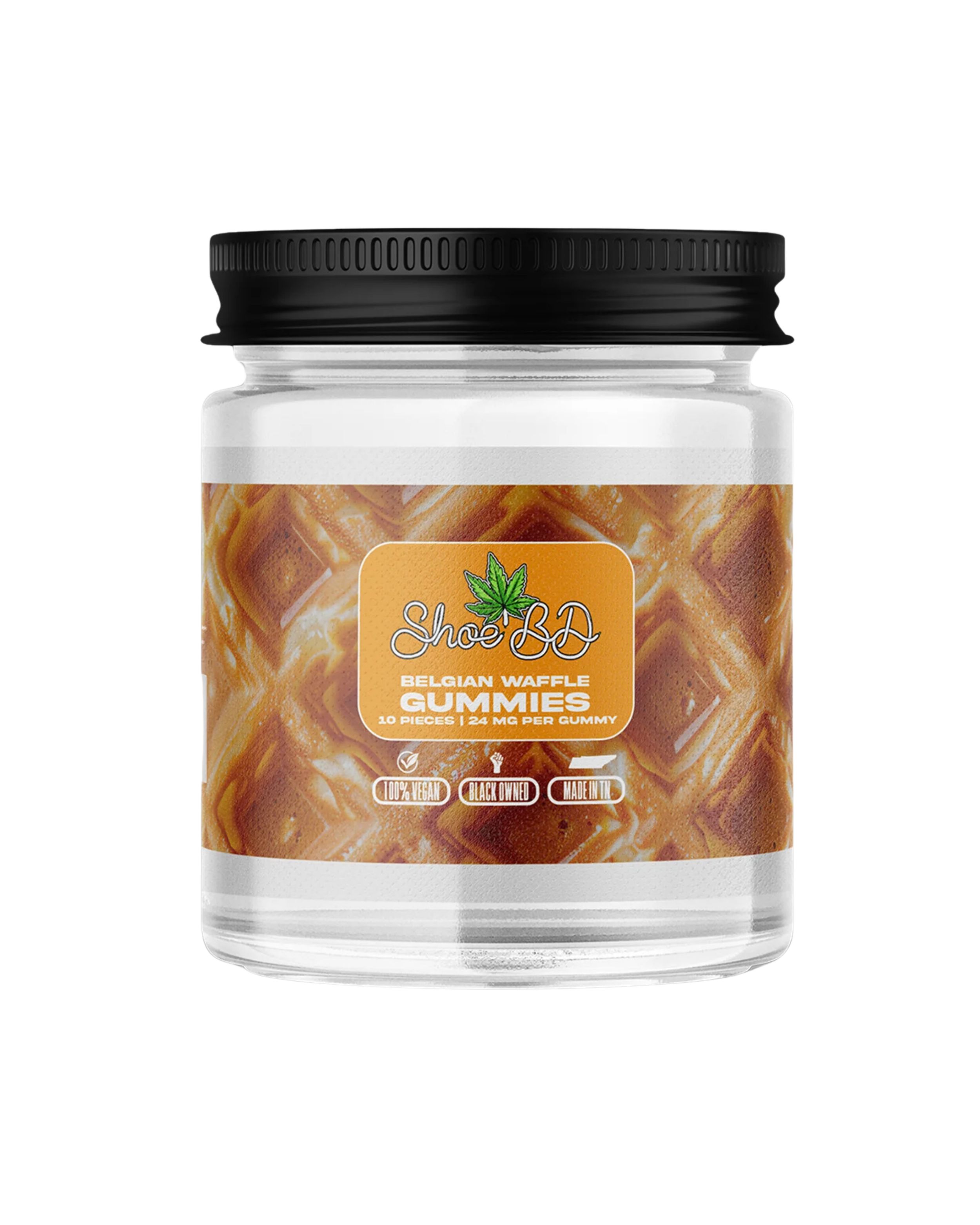
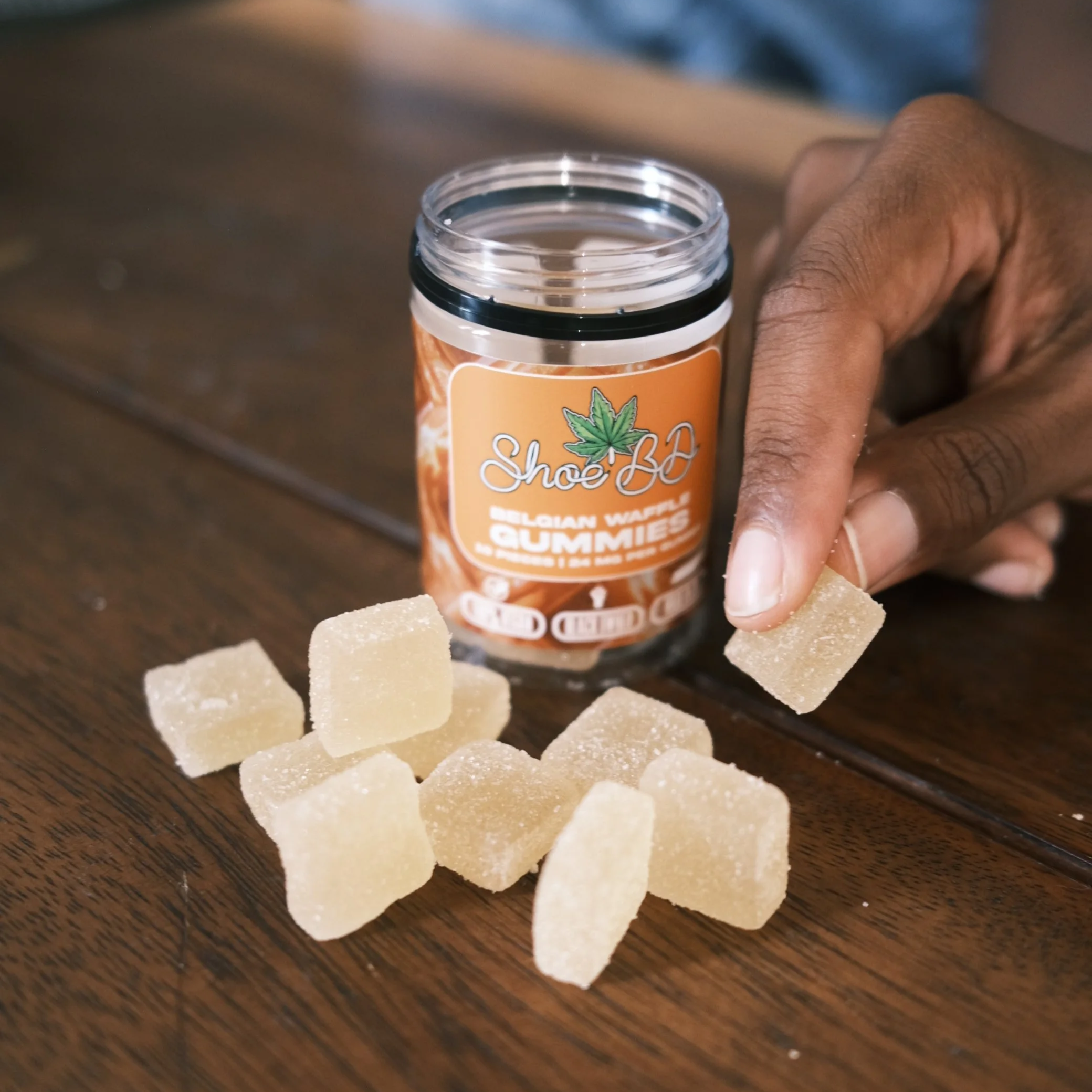
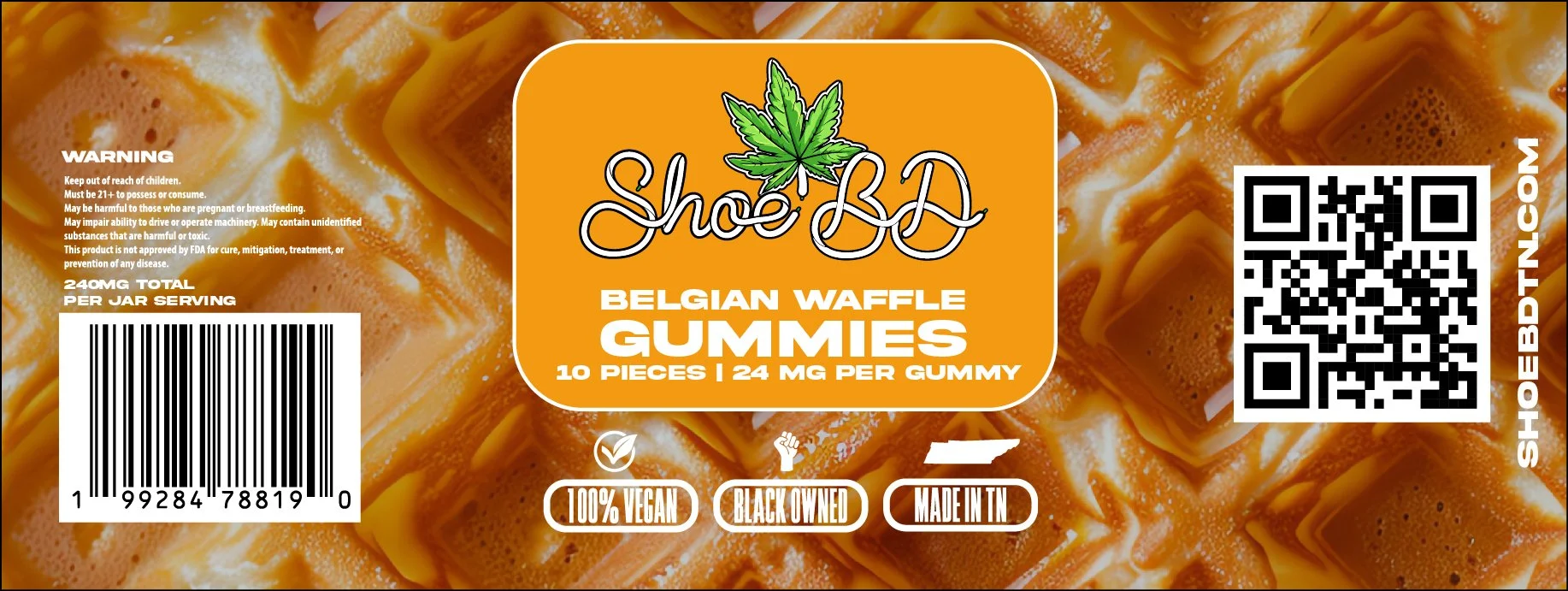
A major part of this project was the packaging system. I designed:
• Custom retail bags that reflect the brand’s bold simplicity
• Jar labels that communicate product identity while maintaining visual consistency with the rest of the brand
The packaging wasn’t an afterthought, it was a fundamental piece of the brand experience. From shelf to customer hands, every touchpoint carried the same visual strength and Tennessee‑rooted authenticity.